Blog
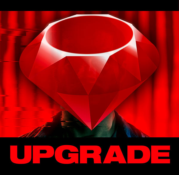
Upgrading Ruby on Rails code - the Definitive List
Most Rails update guides are just sad regurgitations of rubyonrails.org guides. But not this one. Strap in. Get ready. This is the unvarnished, definitive guide to all the gotchas and rabbit holes out there.

Updating your Ruby on Rails application to the latest version
Once upon a time, it wasn’t uncommon for people to leave their web application the hell alone once they’d stabilised things. In the belief that making changes might introduce problems. As we've become more dependent on stable apps, and the threat of cyber security has become bigger, this is no longer viable. It’s really important to keep your Ruby on Rails application up to date

What exactly is a React Developer, and how can I become one?
A React developer is a software developer who specialises in building web applications, particularly front-end user interfaces, using the React JavaScript library. React is a popular open-source library developed by Facebook for creating interactive and dynamic user interfaces

What is a Ruby Developer, and how to become one
A Ruby developer is a software developer who specialises in using the Ruby programming language to build web applications, websites, and various software solutions. Ruby is a dynamically-typed, high-level programming language known for its simplicity and productivity. It's often used in web development frameworks like Ruby on Rails, which is a popular choice for building web applications.

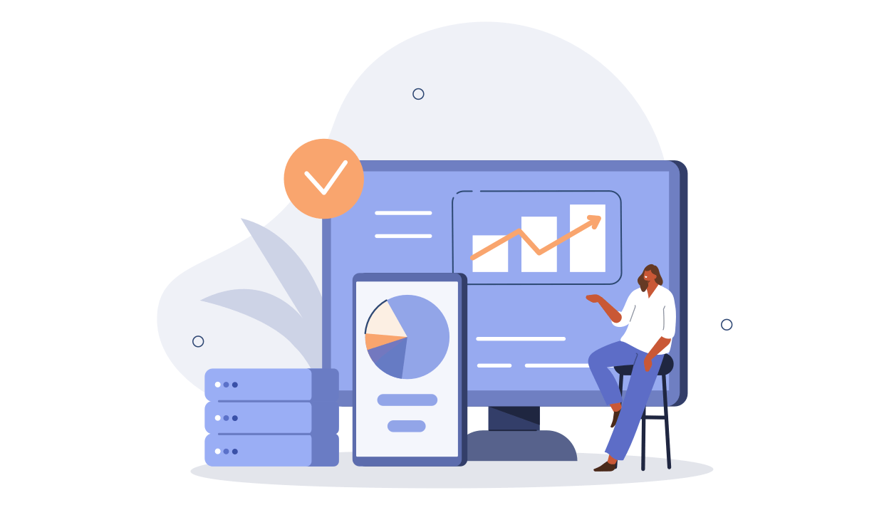
Why it is important to keep your Ruby on Rails application up to date
It's really important to keep your Ruby on Rails application up to date. I know, it would be nice if it just automatically updated itself somehow. Here's some compelling reasons to do that update.
Cyber Security from a Development perspective
The easiest way to exploit your platform won’t be by dressing up in a Ninja suit and breaking into your network. It will be finding a mistake or loophole in your code, and taking advantage.

How a brand new project can still be insecure
So you've just launched your new project. It must be totally secure right? Not always - there are often vulnerabilities that may reveal over time. Here's how we go looking for them.
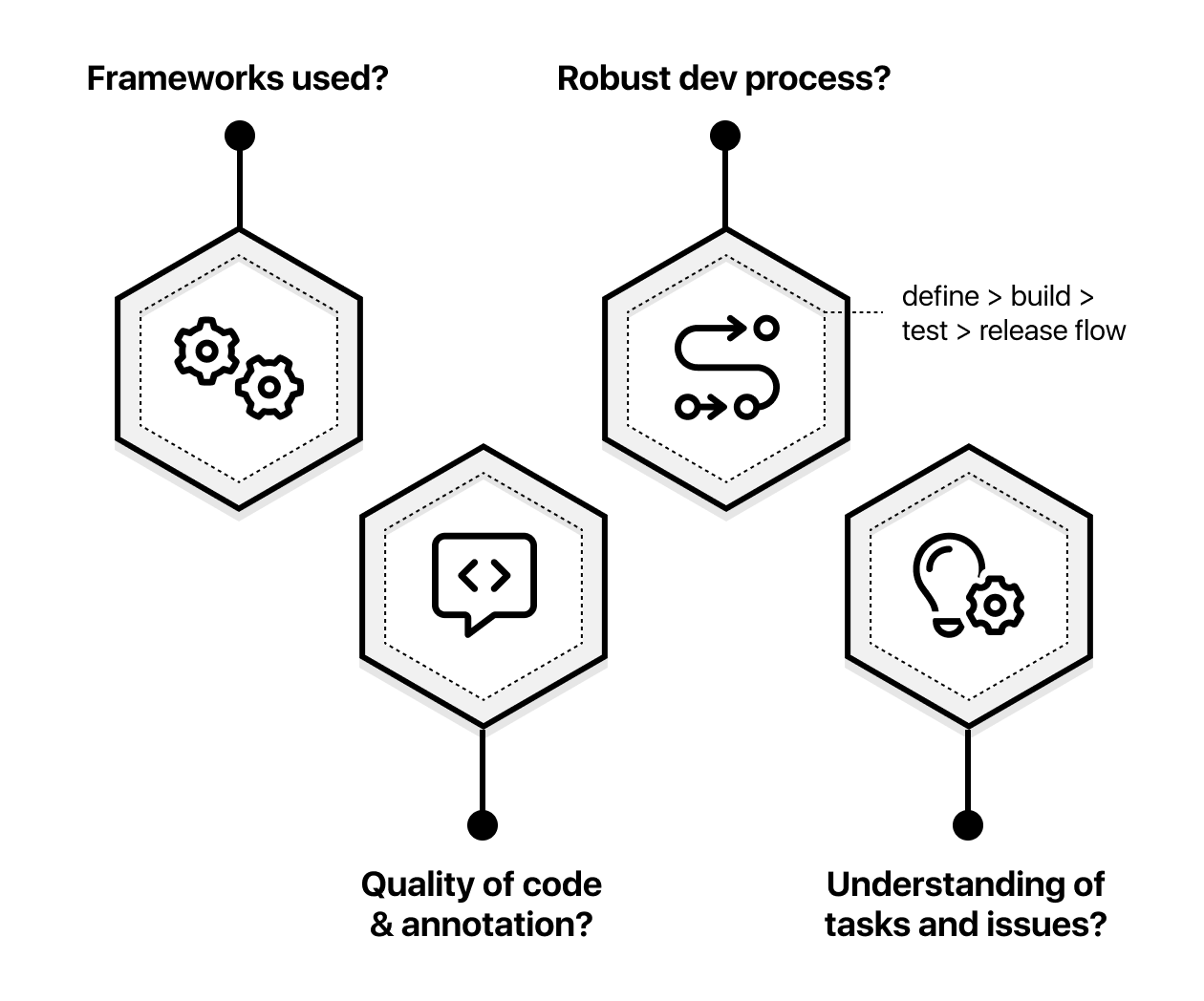
Which technology stacks or frameworks are more or less susceptible to being hacked?
We’re often asked if a particular framework or technology is more or less susceptible to being hacked than another. Or put another way, is one “more secure” than another? While the technology stack kind of matters, it really comes down to ongoing effort and experience of your team in understanding security risks.

Fixing security flaws with a smarter UX
Some security problems come about when the security of information shown isn't considered during the design process. Here's an easy fix, with 4 different approaches to address the issue

Platform Security - maybe you're the security flaw?
Many organisations spend a lot of time evaluating and worrying about cyber risks from hackers or information leaks. But what if the actual security flaw came about as a result of a decision you the Product Owner had made? Some tips to identify and avoid this.

The Goose Strategy: Getting Out Of Scope
The Goose strategy - move your application out of scope as much as you can. Try to keep the really complex parts of your app behind the scenes, and only expose the simple stuff which can be more easily locked down and quicker to audit.
What are the different levels of payment maturity?
A summary of each of the different levels that we use to describe the relative maturity of a payments process. Starting from the very basic / starting off, through to the teams that are really cracking it.

Payments case study - better payments as a way to reimagine your Product.
A case study on a company that explores two options for implementing online payments, and how the results of each of those can impact company business performance going forward
Payments implementation scale
An explanation of the different technical approaches for implementing online payments, from a simple shop on eBay through to a more scalable and custom technical platform.

Where to start on the road to digital payments success?
A checklist of steps to take to begin the process of integrating online payments into your business. Start small and soon, and make sure you validate your plan with key stakeholders.
Automated vulnerability scanning for Ruby on Rails and SaaS projects
Vulnerability scanning software Ruby on Rails analysis
How much should I spend on my website?
Building a SaaS platform isn’t a modular commodity with a fixed price.

Why choose Ruby on Rails?
The no nonsense guide for entrepreneurs, startups, product owners or anyone that is a bit baffled about tech stack options.
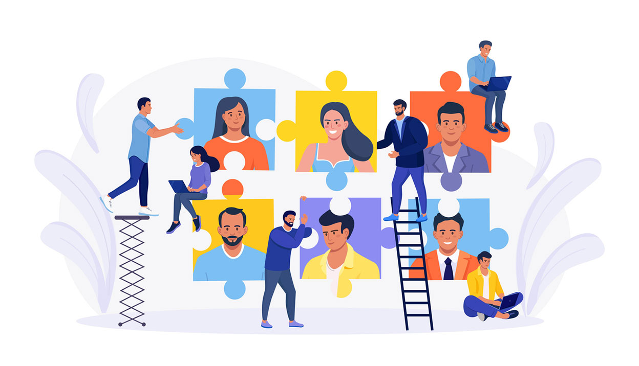
Hiring a web development team you'll love
Working out the best way to resource the development of your project can be hard. It's super competitive, and can be hard to compare apples with apples.
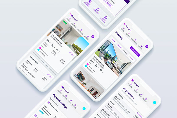
What makes property management so hard?
From the outside looking in, the property management business looks pretty simple.
The hard thing about AI isn't making it - it's testing that it works
Testing Machine Learning or AI powered features is often trickier than it seems

Feeling a bit stuck on your MVP development?
A really common scenario: you've had some code developed, but now you're feeling a bit stuck

The problem with great startup ideas is that everyone has one
Execution matters. Your development team matters.

Why we don't enter awards… And why I irritate Wayne.
I have this friend. Let's call him Wayne. He works in advertising.

Digital agency vs a Technical Agency
Digital agency vs a Technical Agency
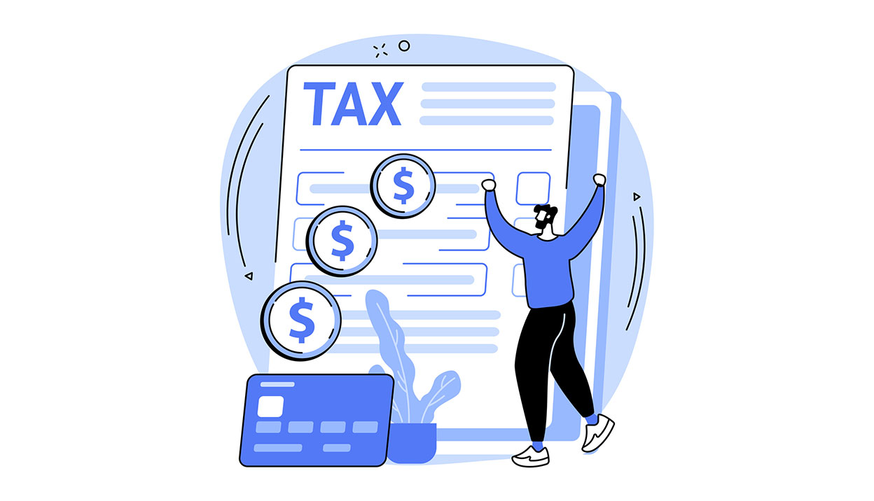
ATO gets sharp on R&D Tax refunds for software development
R&D grants can help offset the cost of development. But you need to make sure you're actually innovating.
Defining a Digital Product
One of the things we focus on is developing Digital Products. These are websites that provide some form of utility to users - these allow people to "do" stuff
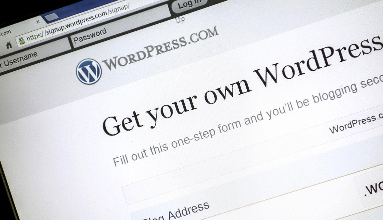
The WordPress Effect
The growth of tools like Wordpress have had a massive impact on the web development market. It's created two very distinct areas with a huge gap between.
Cache busting Gmail's new image caching
This week, GMail announced images are on by default. If you're a marketer, you might have seen some posts about how exciting this is that we can now track emails again.

The perils of ecommerce and how objects may appear larger and better
Ever bought something online that wasn't what you thought it was?
If my customers mainly use mobile devices, should I be building a phone app?
Most of our projects now have over 50% mobile traffic. So mobile strategy is becoming increasingly important
Fast follower strategy DOA?
Five reasons why we think your fast follower strategy might not work out so well.
Getting more efficient with our Ruby on Rails projects
"convention over configuration". How to improve team effectiveness and quality.
Testing web projects
One of the things we've started doing quite differently over the last few years is how we test our web projects

Mobile first - 5 key constraints on mobile devices
Get ahead by going 'mobile first'. Let's take a look at some of the challenges we face when doing so.

Going Mobile
Mobile traffic is growing crazy like. If you're addressing this already by thinking about a mobile aspect of your website, great! If not, read on…
Bypassing the sign up hurdle with super-soft joins
How we use super-soft joins to interact with users on personal subjects.
Manage SSL redirection in Nginx using maps, and save the universe
Solutions to simple yet common and frustrating problems. We spill the beans on how we do it.
How a project gets tested and deployed with GitFlow
GitFlow is the way of the future. Find out why and how here.
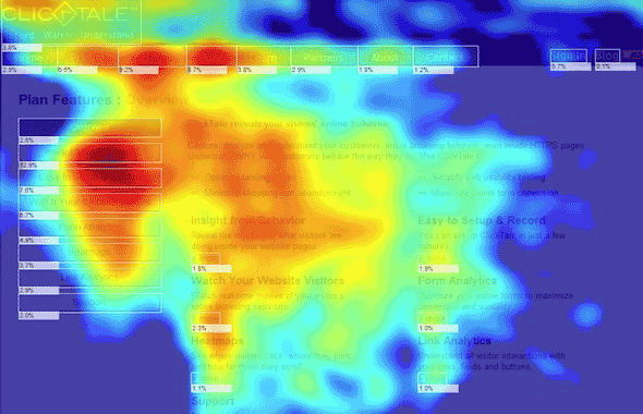
Clicktale Review - how the technology works and why it didn't for us
It could be so good, but sadly Clicktale doesn't do everything it says on the box.
Setting Jira priorities - Team Six and The Iceberg
Seal teams, titanic sinkers and our prioritization ratings.

10 ways to improve your phone app development brief
Ten quick tips: considerations for your iphone app design brief
Why we use Ruby on Rails
We do a lot of work with a programming language called Ruby on Rails. This is why.
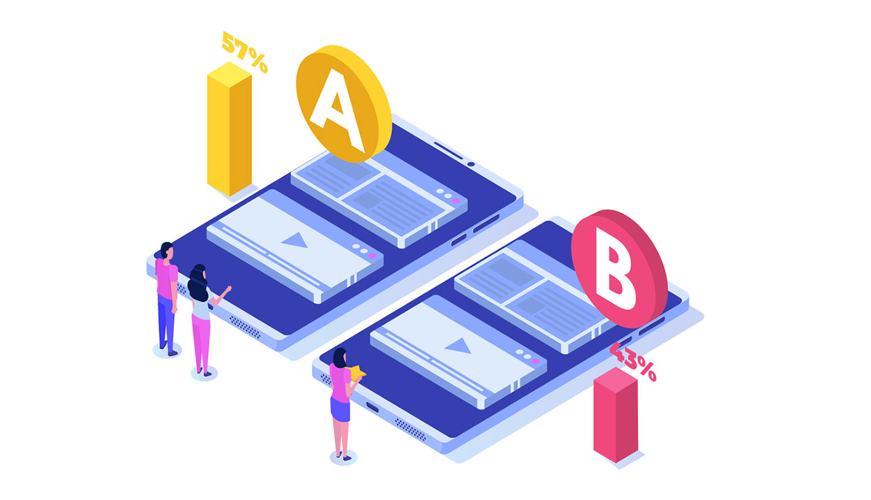
Multi-variate testing
Lately, we've been doing quite a bit of work on sites which involve multi-variate (MV) testing
Fat footers - should they include a sitemap
There's a bit of a design trend at the moment towards making more of the footer area at the bottom of your site.
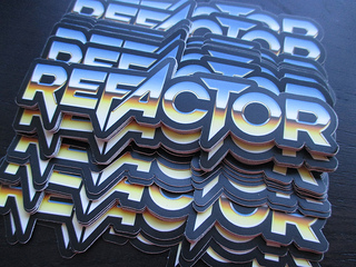
Refactoring a design
We've recently spent some time adding some new features to a site that we built a while back.
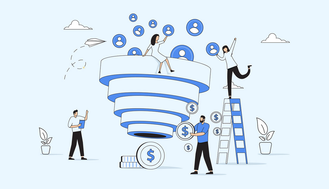
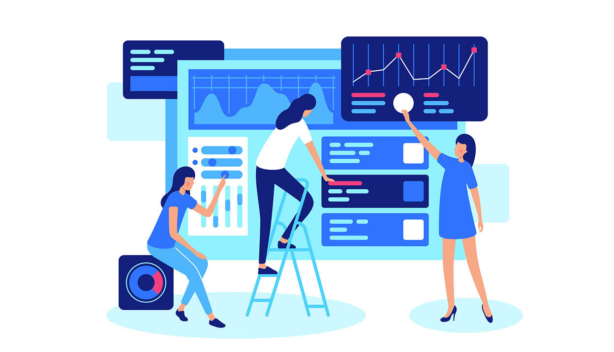
Visualising your online customer funnel
Refine your user experience and create better ROI by taking an internal look at what happens when your customer visits your site.

Red Ant web design award at UTS
It's been a good few years of sponsoring the UTS design awards, here's to this one, and many more!

Red Ant creative award at UTS
We're sponsoring an award at the design school of University of Technology, Sydney.